Our Methodologies
Transforming raw data into meaningful context
(AKA: the magic - and the madness - behind the metrics!)
- Data driven insights
- Contextual analysis
- Continuous refinement
Reliable Sources of Information
We don't believe in publishing just numbers. After all, data is meaningless without some sort of context.
That's why our goal at PostcodeArea is to bring you analysis and insight behind postcode data. However, that's a real challenge. Taking data and attempting to see the bigger picture for EVERY postcode in the UK is a huge task which one person alone cannot - despite trying - accomplish.
Reliable Data
We source data from official sources, including the Office for National Statistics, Ofsted, NHS, NaPTAN, Police.UK, and many others.
Human Examination
Datasets are thoroughly checked for errors and inconsistencies by the founder, before being used for any data analysis on PostcodeArea.
Machine Learning
AI and Machine Learning technology is used to transform the data into meaningful insights and analysis, and regularly checked for accuracy.
Census 2021 data
Data from the Census 2021 is vast. It contains millions of records of data stretching the length and breadth of the nation. Without it, there would be no PostcodeArea.
But this data comes with inherent limitations. First, the data consists of records taken at "Output Areas" as defined by the Office for National Statistics (ONS). These output areas range from nationwide, through to local authority, MSOA (middle super output area), LSOA (lower super output area) and OA (output area), which contains information on a neighbourhood scale.
On a postcode level
What it doesn't cover is postcode level. For the ONS, that's a whole different thing which they don't (or can't) provide information for. It's not in their remit.
Not to be deterred, at PostcodeArea we match postcodes against Output Areas, the smallest unit in terms of population/households. That gives us a good starting point for taking the data and transforming it into something meaningful - and hopefully insightful.
Look out for more information over the coming weeks how we consolidate all the information together, and how we use AI and Machine Learning to help you understand not just the data - but the stories behind the data.
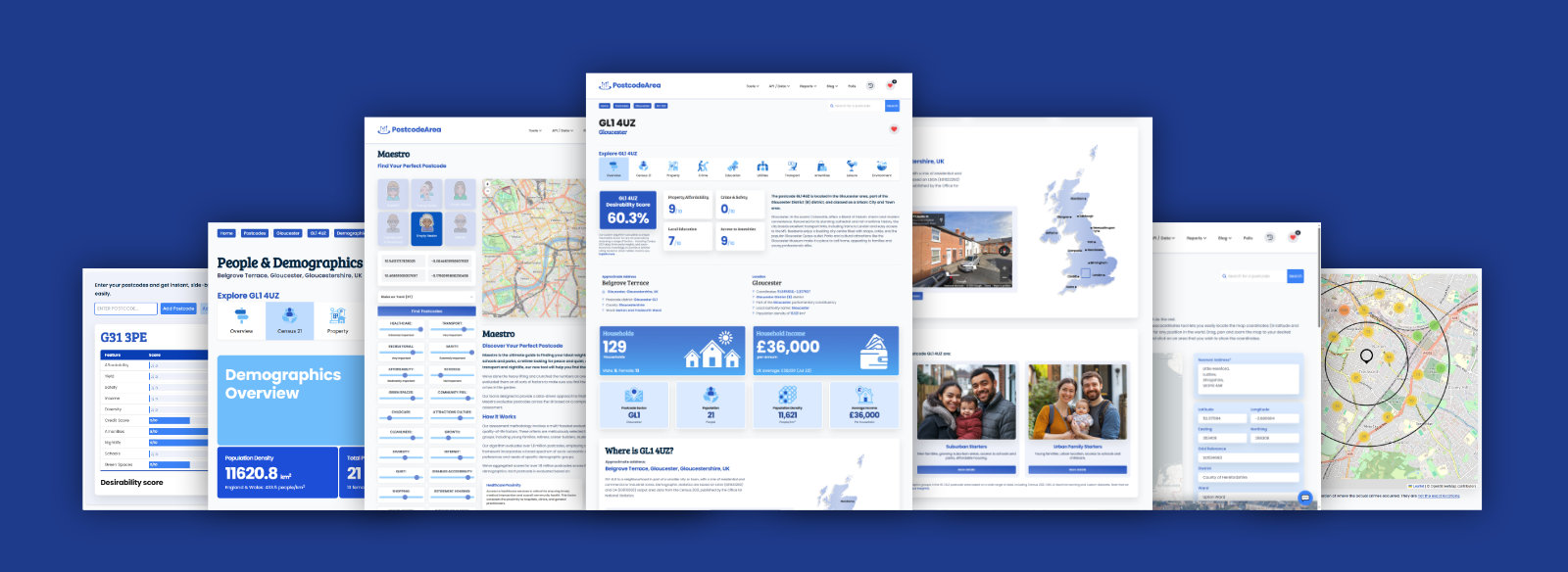
Desirability Index
Ever wondered how we transform masses of raw data into our desirability index? Shall we take a look into how we do it? Spoiler alert: it’s a mix of data wizardry and a sprinkle of statistical alchemy!
Step 1: Gathering the Ingredients
First things first, we need data. Loads of it. Imagine you’re making a cake (a big one) and need flour, eggs, sugar, and all the basic ingredients. In our case, we’re talking about: a) proximity data (think distances to schools, healthcare facilities, parks, and public transport) and b) Census Data (demographics, employment rates, housing conditions, etc.) In fact, we're talking about more than 60 data points in total.
That's a lot of information to import into the database. So much so, that it's taken me almost a decade to get hold of all the data. In total, the algorithm has to work with over 100 million records of data to build the Desirability Index.
Step 2: Cleaning Up the Mess
Raw data is like my daughter’s bedroom – it needs a good clean-up and tidy-out. We start by scrubbing the data, removing duplicates, handling missing values, and ensuring consistency. For instance, if proximity data has null values (empty) for some locations, we fill in the gaps with sensible estimates.
Clean data is reliable data, and reliability is key when you’re trying to create something meaningful as the Desirability Index.
Step 3: Harmonising the Dataset
Next, we need to make sure our data is working in harmony across many different tables in the database. This means standardising the formats and units.
For example, proximity data might be in miles while other datasets could be in kilometres, so I need to convert everything to a common unit. The data fields are also aligned, ensuring that we’re comparing apples to apples. For example, we standardise income data and housing costs to reflect current values.
Step 4: Merging the Data
With our data cleaned and harmonised, it’s time to put it together into something more meaningful that not only shows data, but also provides the context. After all, what's the point in data if it means nothing to the reader?
This is where the magic begins. We use unique identifiers – like postcode areas – to join the proximity data with the corresponding Census Data. Think of it as creating a giant spreadsheet where each row represents a specific area, and each column represents a different metric of desirability.
Step 5: The Desirability Algorithm – Weighted Scores
Now, let’s get to the heart of the index – the desirability index algorithm. An algorithm is a fancy way of saying a "computer program" that is able to look at the data and interpret, compare, and align data.
We assign weights to different metrics based on their importance. For instance, access to healthcare and safety might be more important than nightlife and shopping options, depending on the target audience of course. We multiply each metric by its weight and sum them up to get a weighted score for each area.
Here’s a peek under the hood:
(healthcare_score * healthcare_weight + transport_score * transport_weight + recreational_score * recreational_weight + safety_score * safety_weight + affordability_score * affordability_weight + ...) / total_weights
Desirability Algorithm at work
As you can see, each score is meticulously calculated and then combined to produce a single, easily comparable desirability score for each postcode area in the UK. That's quite a lot of processing involved, and whilst it was running I had to add extra fans inside my computer to ensure that the CPU was cool and efficient to handle all this data. During the process of calculating the scores, the CPU was constantly at 100%... for 3 weeks, 24-hours a day!
Step 6: Ranking and Filtering
With our scores in hand, we rank the postcode areas from most to least desirable. But we’re not done yet. To ensure fairness and relevance, we group the areas by specific categories, such as counties or regions, and select the top-performing ones.
This is like picking the crème de la crème from each category, ensuring we’re highlighting the best of the best. What it also does is to take into account that some wider areas (such as inner cities) are not over-represented by the sheer amount of postcode density. What do I mean? Well, if a particular area in a built-up area - of, let's say 500 acres - has more postcodes than another rural area of similar size, then the algorithm would naturally return more "desirable" postcodes because of the sheer number of potentials to choose from.
So, this has been taken into account too, to ensure a level playing field that doesn't push less dense postcode areas out of the equation.
Step 7: Visualising the Results
Finally, what good is all this data without a bit of visual flair?
We turn the numbers into interactive maps, tables and charts. These visuals help users quickly grasp which areas are most desirable based on their preferences. It's one thing to say a place is great; it’s another to show it.
Again, it's always been my intention to not just provide the data, but to also give a little context to the data. That's why Postcode Area is possibly the only website (apart from the ONS) to actually take the time to contextualise the data to bring meaningful insights into the neighbourhood that is home to the postcode.
During this process, we use machine learning tools to help us to speed up the process of analysing all this data. There's no way that we could have done it without the help of OpenAI, which was instrumental in doing the number crunching.
Where does that leave us?
It's been a long and arduous procedure. The original www.postcodearea.co.uk was a task in itself, but the latest revamp has been designed to take this initial data, update it, and provide information, knowledge and insight too. To be fair, it's long overdue.
Creating a desirability index from raw proximity and Census Data is no small feat. It’s a journey from chaos to clarity, involving data cleaning, standardisation, merging, weighting, and visualising. But the result is worth it – a powerful tool that helps people make informed decisions about where to live, work, and play.
But we understand that there's still quite a journey ahead of us. We're still double-checking the AI output and our custom-built algorithms against millions of records of data. It's not perfect, but it's our goal to get there.
Until next time, happy data crunching!
Unlock the full power of postcode insights.
Data is meaningless without context. Reveal the stories behind a neighbourhood, and make smarter decisions with data you can trust. Gain unlimited access to detailed statistics, exclusive reports, and essential tools.
PostcodeArea is grateful to our sponsors for their support.